Profound Brand Guidelines
We've created the following guidelines to help you accurately and consistently represent our brand, without having to negotiate legal agreements for each use.
Naming
"Profound" should always be written as a single word with a capital "P". When mentioning specific Profound features, please treat them as proper nouns and capitalize them accordingly (e.g., "Profound Agents")
Isotype
The Profound symbol is a distinctive element of our brand identity. It is essential that the symbol be used in its original design and proportions to maintain brand consistency.
Wordmark
When utilizing the wordmark, it should be maintained in its original design and proportions to ensure consistency and recognition. We recommend using the Profound wordmark for most use cases unless otherwise specified.
Colors
Profound's visual identity primarily utilizes black and white for marketing purposes, symbolizing simplicity and elegance. These two colors should be consistently used across all promotional materials to ensure brand recognition and coherence.
Profound Light
RGB 255, 255, 255
#FFFFFF
Profound Dark
RGB 0, 0, 0
#000000
Profound Blue
RGB 55, 108, 255
#376CFF
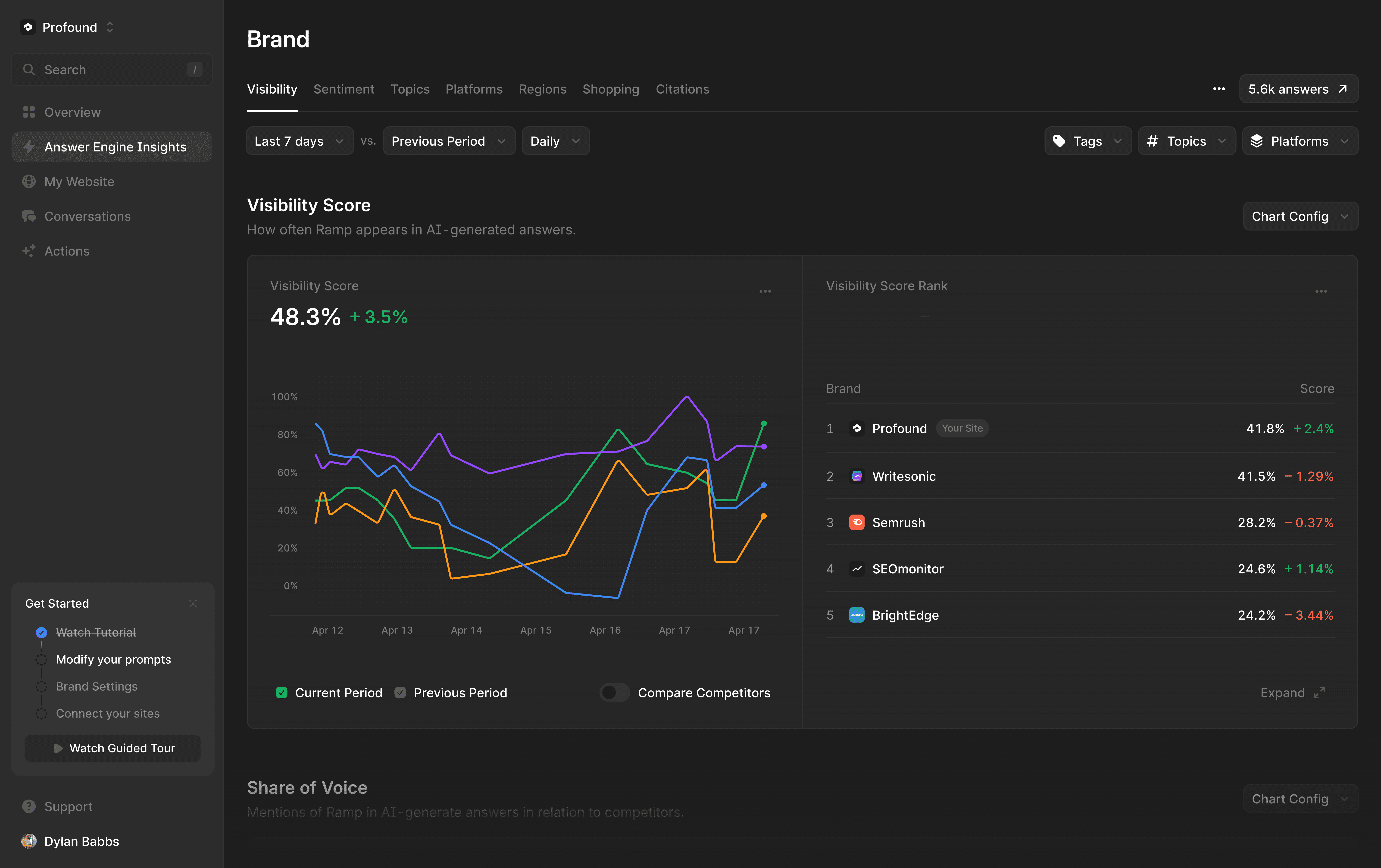
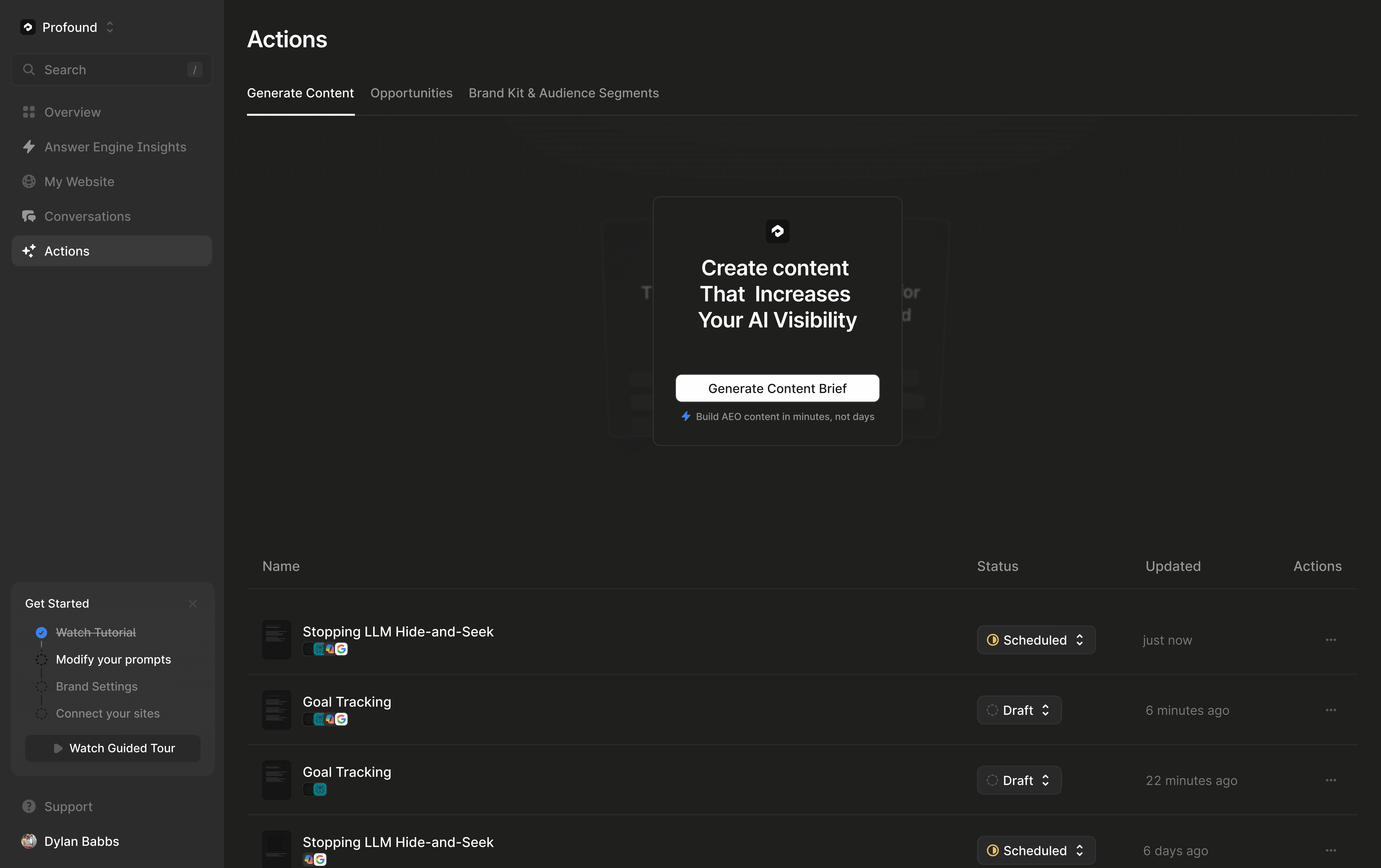
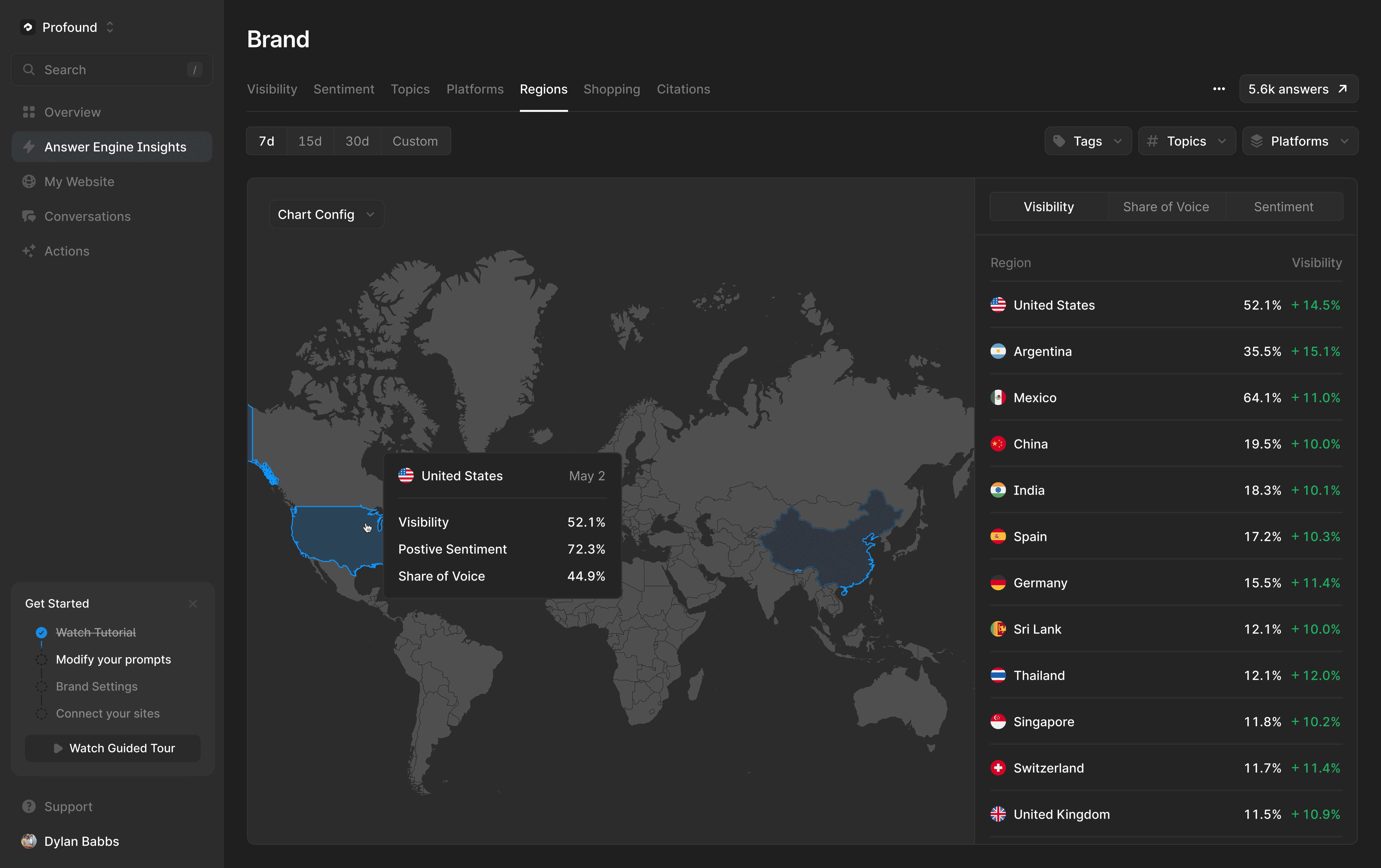
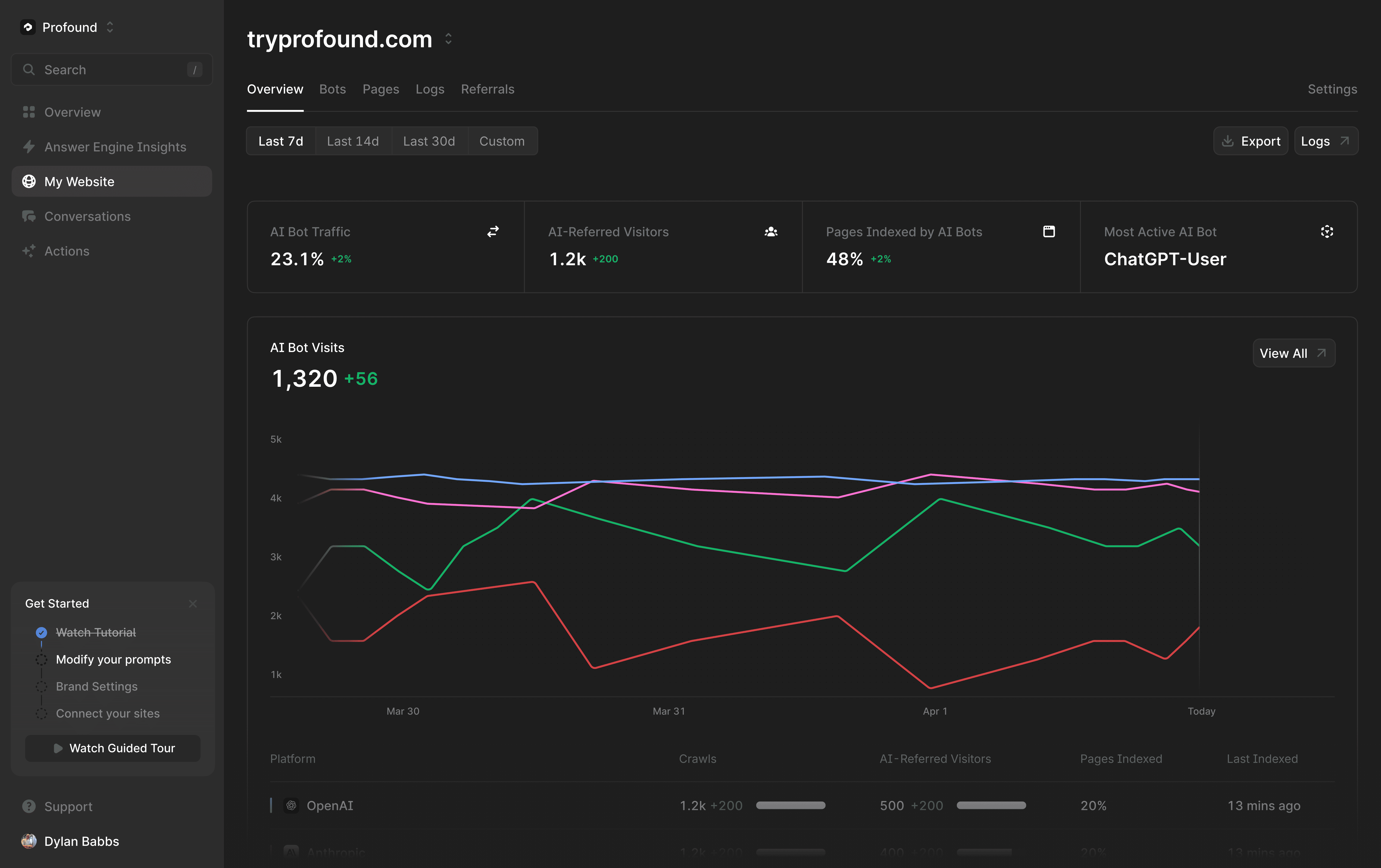
Screenshots
High-quality screenshots and interface mockups for marketing and presentation purposes. These assets showcase the Profound platform in action and should be used when demonstrating our product capabilities.


Want to help us shape Profound brand identity? Join the Design Team